Create a pictorial chart and discover important patterns and trends

A pictorial chart is a visual representation of data that uses icons. Learn how to create an effective pictorial chart quickly with Infogram's free chart maker.

Try Infogram for free
4.5
140 reviews
interactive_pictorial_charts

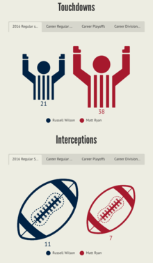
A pictorial chart (also called a pictogram, a pictograph, or a picture chart) is a visual representation of data that uses pictograms – icons or pictures in relative sizes – to highlight data patterns and trends. Pictorial charts are common in business communication or news articles to visually compare data.

With Infogram, you can quickly create professional pictorial charts for your business or personal use. It's easy to get started. Just choose pictorial chart templates created by our designers. Add icons, text, adjust colors, and visualize your data to engage your audience from the first glance. 

Read on to learn more how to create a pictorial chart online using our easy-to-use pictorial chart maker. Don't worry, we're handling the complicated pieces, allowing you to focus on making engaging, interactive, and educational content that makes an impact.  

Everybody Love Infogram

Many of our clients are excited by the service that we deliver.
Read about what some have said about us.

“ With Infogram we turned our service reporting into the cutting-edge category and receive amazing feedback from the user community. ”

Andreas Igler

Andreas Igler
Director of IT & Operations

“ I’m a data nerd, so I love tools that help readers better visualize information. We use a tool called Infogram at TechCrunch for data visualization. It’s super-easy to use, and you don’t have to be a data analyst or graphic designer to use it. ”

Travis Bernard

Travis Bernard
Director of Audience Development

“ Infogram has taken our stats to the next level. It's great to be able to upload a spreadsheet and turn it into a beautiful interactive piece for our clients to enjoy. ”

Kris Carpenter

Kris Carpenter
Director of Marketing

Browse all pictorial chart templates

Want to get started right away and create a pictorial chart? Choose our ready-made chart templates to stand out from the sea of “meh” content. Keep it simple and create a professional-looking pictorial chart in seconds.

Column Chart
Column Chart
Line Chart
Line Chart
Table Chart
Table Chart
Pictoral Bar Chart
Pictoral Bar Chart
Radial Chart
Radial Chart
Semi circle Chart
Semi circle Chart
Funnel Chart
Funnel Chart
Column Stacked Chart
Bar Chart
Bar Chart
Pie Chart
Pie Chart
Wordcloud Chart
Wordcloud Chart
Doughnut Chart
Doughnut Chart
Pictoral Chart
Pictoral Chart
Column Grouped Chart
Bar Stacked Chart
Bar Stacked Chart

Frequently asked questions

How do I register an account?

1. Click on the Get started button in the top right corner of the homepage.

2. Sign up with Google, Facebook, or email. If you choose to sign up with Google or Facebook, simply login to your account when asked to do so. If you wish to sign up with your email address, enter the email and your desired password, then hit the Signup button.

3. Provide some basic information about yourself. Enter your first and last name, indicate what kind of organization you belong to, and specify your role. You will then be able to continue with the Basic plan or choose from any of the available paid plans. View more

When to use a pictorial chart?

Pictorial charts are often used to compare the number of units, size, or progress. A pictorial chart is a great choice when comparing a few categories with clear differences. Pictorial charts are very common in business communication and media (for example, in news articles or infographics).

Pictorial charts are a great pick whenever you want to make your data stand out and become more memorable. When designed effectively, pictorial charts will make a great addition for:

1. News articles

2. Reports

3. Infographics

4. Presentations

5. CVs

How do I create a pictorial chart?

Infogram's chart creator allows you to quickly make a pictorial chart in just 5 steps:

1. Log in to Infogram

2. Select the pictorial chart type (the classic pictorial chart, size comparison, or pictorial bar)

3. Upload or copy and paste your data

4. Customize the labels and icons, then adjust the design by changing the background, colors, and fonts

5. Download your pictorial chart, add it to your report, infographic, embed it on your website, or share it on social media

Infogram is super easy to use and made with non-designers in mind. Even if you don't have any programming, coding, or design experience, you'll be able to make pictorial charts in just a couple of steps. 

We did all the technical work for you. Now, all that's left to do is start creating.

What are some best practices for creating pictorial charts?

Here are some general tips to keep in mind to make a pictorial chart like a superstar:

1. Find the right icon. The power of pictorials is in their familiar shapes, so try to find icons that represent your categories. 

2. Avoid using very detailed icons. That way, the reader will be able to understand your chart at a glance. Try to think of the simplest picture that represents the data.

3. Avoid large data sets. Using a pictorial chart for large data sets will make it hard to count the values.

What are the origins of a pictorial chart?

The origins of the pictorial chart can be traced back to the history of civilization. Early written symbols were based on pictographs (pictures that resemble what they signify) and ideograms (symbols which represent ideas). Ancient Sumerian, Egyptian, and Chinese civilizations began to adapt such symbols to represent concepts, developing them into logographic writing systems.  

The idea of the universal language of pictorials was best developed by an Austrian social scientist Otto Neurath and a German designer Gerd Arntz in the late 1920s. Together, they were the perfect fit to develop an ISOTYPE (International System Of Typographic Picture Education) – a set of 4,000 pictograms that could express almost anything.

Learn more about the history of the pictorial chart here.

How can I style my pictorial chart?

You can customize any pictorial chart to your liking. Pick the right color palette and font, adjust the labels and icons, and even add animations. To edit your chart, click on it, then go to Settings and make the necessary changes.

Didn't find the answer? Check our FAQs